Proportional fonts for programming
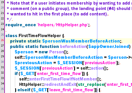
I'm trying out some proportional fonts (as opposed to monospaced) for coding. The one shown above is Franklin Gothic Demi – it's normally a serious font but the color livens it up a bit. The editor is the venerable jEdit.
Part of the reason I'm paying more attention to fonts this week is that I've almost finished reading Bringhurst's The Elements of Typographical Style. It comments on typography with an authority and grace comparable to that in Tufte's Visual Display of Quantitative Information (on figures and charts).
posted by Jonathan at
10/16/2006 12:44:00 a.m.
![]()
![]()


6 Comments:
Hi Jon,
I've been think about fonts lately too.
I wonder what "column width" you use when coding in this style? You can't exactly break at the 80th column.
@reed - I think the main reason for using a monospace font is that you can't line up long lines with a break in with a proportional font. This is an "in the small" example of the wider point which is that what you write won't look the same to the next guy. If you use a monospace font, it will (within reason).
By Thomas David Baker, at 10/16/2006 5:19 a.m.
hejdig.
I code in Arial, somewhere around 9 points. The only downside I know of is I and l (capital i and non-capital L).
Not having the code in straight columns enhances the readability IMHO.
/OF
By Anonymous, at 10/16/2006 9:30 a.m.
reed - a typophile! Beauty! Ha! I shall follow your advice to not obsess about it.
bakert - read your post - interesting stuff. sIFR isn't great but it has its uses (esp. for headings, as you mentioned). As for column width, I'm torn between disregarding it (and simply using the width of the editor window), and obeying 80 chars. In the screenshot, the vertical line is at 80.
losmanos - yeah Arial looks quite nice on the screen. A nice change from Courier.
By Jonathan, at 10/16/2006 1:04 p.m.
Reed - Sounds like you derive tremendous joy and pleasure from typography. I shall check out typophile.com now.
By Jonathan, at 10/16/2006 9:54 p.m.
@Jon - but what is the meaning of "80 columns" with a proportional font? 80 spaces? You can fit more than 80 "i" characters in the same spaces as 80 "w" characters with a proportional font. So then you will have lines that don't reach your vertical line that are "wider" than 80 chars!
By Thomas David Baker, at 10/28/2006 2:41 p.m.
Hi bakert – yeah, I basically ignore that vertical line. I should figure out how to turn it off actually, as it's not very meaningful for proportional fonts.
By Jonathan, at 10/28/2006 3:31 p.m.
Post a Comment
<< Home